BACKGROUND ESSAY: MS 17: DECORATION
1. Colour in MS 17
2. Calligraphic adjuncts
3. Tables, diagrams and schemata
3.1 Framing lists and tables
3.2 Architectural frames for tables
4. Figural illustration
The careful and aesthetically self-conscious work of the scribes who made MS 17 is complemented by a beautiful and varied decorative setting. Much of this impression is due to the delicate colours employed in the initials and decorative frames of the tables. The texture of the pigments is correspondingly gentle: matte and opaque when applied thickly, and sometimes thinned to a transparent wash. In combination with the neat Caroline hands of the scribes, this lends a somewhat old-fashioned look to MS 17, redolent of Anglo-Saxon coloured-ink drawing. Indeed, coloured scientific diagrams appeared in later Anglo-Saxon art in conjunction with coloured display capitals, which were used to link text and illustration; this had a significant impact on the development of the native coloured-ink technique.1
MS 17's palette comprises the following: yellow; cream (probably a thinned yellow); celadon green, usually transparent; dark green, largely used for initials like the KLs of the calendar pages; vermilion red, quite opaque, and also used for lettering and ruling the frames of tables; pink; dark brown (perhaps Scribe A's usual ink applied as a pigment); dusty purple; powder blue; and dark blue. The colour combinations in the frames of diagrams and tables can be dramatic, such as the juxtaposed reds and greens in the litterae punctatae table on fol. 10r and the AEIOV table on fol. 24v, or the gaudy multi-coloured columns of the table of termini of moveable feasts on fol. 28v. At other times, the effects is more subtle, for instance in the feria of terminus table on fol. 32r, where a wave motif in brown on yellow decorates the central arch, while the pediment carries the same motif in reverse, yellow on brown.
Colour was also used to enhance the legibility of diagrams, and to draw attention to the coherence of structure and content. An excellent example is the Isidorean syzygia elementorum on fol. 39v, where green arcs around the temperature segments (calidus and frigida) and red arcs around humidus and sicca reinforce the tension and balance of the paired qualities. Here colour could be said to perform an exegetical function. In other instances, however, practical considerations seem uppermost. On the pages of the calendar, risk of confusion amongst the several columns of key-letters to the left of the martyrology is reduced by lettering them alternately in red and green. Alternating the coloured spokes of the rota of epacts on fol. 27r and the rota of feriae on fol. 27v also prevents the eye from skipping. The use of colour as a reference key is demonstrated by the taxonomy of knowledge on fol. 7r. The large arcs of theorica and practica are each divided into three colour-segments, corresponding to the three divisions of theoretical and practical philosophy. These colours correspond to the roundels underneath, where these divisions are defined. In the second divisio, the roundels are closely clustered around the greater arcs, so matching colour is not necessary for reference. To the contrary, the arcs and roundels are presented here in contrasting colours, in order to emphasize the distinction between genus (e.g. physica in blue) and species (e.g. arithmetica, geometrica, musica and astronomia in cream.
2. Calligraphic adjunctsThree kinds of ornament are used to enhance the scripts of MS 17: calligraphic capitals, decorated initials, and brackets to catch single words or syllables left over at the foot of a text column.
Calligraphic capitals are large initial majuscules or display letters executed in coloured ink. They are either plain, or decorated with some very restrained ornament which is strictly subordinated to the letterform. The calligraphic capitals which open texts and paragraphs in MS 17 are elegant and open, adding to the page's overall impression of lightness and simplicity. All are in single colours, save for the initials on fol. 6v (degrees of affinity), 55r-v, 158v, and 168r-v, and the display capitals on fol. 58v (incipit of Bede's De temporibus), which are drawn in the text ink and loosely filled with colour. The latter resemble Norman display script, characteristically formed of brown ink letters filled with red or green.2
The uniform style of these calligraphic capitals suggests that they were executed by a single scribe. This might be Scribe A, because calligraphic capitals appear in conjunction with Scribe A's rustica in several tables, for example the key-letter tables on fol. 30v. While they usually appear as single initials, calligraphic capitals can be joined to form a line of display script, as in the openings of Bede's De temporibus, and in the chronicle of De temporum ratione on fol.104v. Elsewhere in MS 17, display script is normally unadorned rustica. MS 17 does not follow the Norman custom of easing the transition from the initial to text by a bridging line of rustic capitals.
As initials, calligraphic capitals vary from one to eleven lines of ruling in height. A wide range of sizes can be found on a single page. Sometimes the initial is wholly in the margin; at other times, it is set into the writing frame. In form, calligraphic capitals are a free but restrained interpretation of quadrata, supplemented by round-backed E (e.g. fol. 101v), uncial D (e.g. fol. 167r), rounded M (e.g. fol. 104r) and a lower-case style H (e.g. fol. 96r). Serifs are prominent without being flourished; the contrast of thicks and thins is strong.
Any decorative elements used to enhance this calligraphic capitals are built into the letterforms themselves. These include: splitting the hast by a straight or zigzag line (e.g. A on fol. 104v, B on fol. 135v); doubling the bows of D and P (e.g. fols. 65v- 159r); or dividing the left-hand stroke of A by an "eye" (e.g. fol. 138v). A simple bead is frequently added to a hast or cross-bar (e.g. the D on fol. 90r, the S on fol. 97v), and the left hast of N or cross-bar of A is sometimes drawn out into a languid wave (fols. 162r-168v). Finally, a flat leaf-like curl or spray sometimes sprouts from a bead, or from the foot of a letter (e.g. the P on fol. 60v, the Y on fol. 63v, the E on fol. 85v). This spray is occasionally doubled by a thin outline stroke (e.g. fol. 165v), which in turn can be elaborated into a scalloped ridge (fol. 166v). In the KLs of the calendar pages, the spray is split and curled into elegant arabesques; in the initial of Helperic's De computo (fol. 123r), it is bent into delicately threaded spirals.
This type of decoration recalls the "flat-foliage" motif - unshaded, stylized leaves sprouting from letters drawn in single, relatively transparent but brilliant colours - found in Anglo-Saxon,3 Norman,4 and post-Conquest manuscripts, notably those from Bury St Edmunds.5 It is interesting the MS 17's sibling manuscript, the "Peterborough computus" also contains flat-foliage initials; a rather striking example of the Peterborough scriptorium's skill in this kind of ornament appears in the abbey's titulus in the mortuary roll of Vitalis of Savigny.6
MS 17 contains only one fully decorated, multi-coloured initial: the A which opens the first chapter of Helperic's De computo (fol. 123v). All of its component elements can be found in the calligraphic capitals, but playing a subordinate role: zigzag splitting of hasts, trumpet-shaped terminal with a doubling line, and spiraling fronds of flat foliage. The strip of alternating beads and bars can be found in the borders of MS 17's tables and diagrams. Close cognates to this initial appear in the nearly contemporary St Alban's Psalter;7 this suggests a regional calligraphic practice, perhaps sustained through the exchange of pattern sheets or manuscripts.
The third calligraphic adjunct is a series of decorative brackets used to contain a final syllable of a word, or word of a sentence, when these fall beyond the end of a column. They occur exclusively in the text of Bede's De temporum ratione, written by Scribe B. It is noteworthy that Scribe A is not averse to breaking words between columns (e.g. fol. 159r) or even pages (e.g. fol. 158r-v). Scribe B's brackets take a variety of forms: a plain L (fols. 78r, 83v, 86v, 91v etc.); a rudimentary basket of three scallops (fols. 73r- 75v); a more elaborate cup or bow of outlined plant stems, ending in tightly curled leaves (fols. 76v, 77r, 78v, 80r etc.); and finally a zoomorph such as a wyvern (fols. 81v, 98r) or dog (fol. 101r). While apparently somewhat unusual in contemporary Norman illumination, brackets can be found in mid-12th century Canterbury books, often as small lion or human heads with protruding tongues.8
3. Tables, diagrams and schemataIn recent decades, the distinctively medieval way of uniting text and image to achieve the graphic representation of ideas (scientific, philosophical, religious or imaginative) has received considerable scholarly attention.9 However, within the narrower field of scientific or technical graphic representation, while there has been some progress in surveying the variety of illustrations,10 a stable and functional typology has yet to emerge.11 It is therefore with the view to initiating discussion on this issue that the following provisional typology is proposed.
There are essentially three types of medieval graphic presentation in subjects broadly classifiable as scientific or technical: reference tables, pedagogical schemata, and symbolic diagrams. The type most commonly found in computus manuscripts is the reference table, whose function was combinatory, i.e. to sort, find, and manipulate data. The auxiliary tables to the solar calendar found in the section of MS 17 entitled Computus Texts and Tables II are examples of reference tables. But medieval computists were also acquainted with pedagogical schemata, graphic "visual aids" such as geometry drawings or astronomical diagrams (e.g. the illustrations to Abbo of Fleury's tract on the motion of the Moon on fol. 38v-39r) ; their purpose is illustrative, to clarify factual information which by its nature is more readily grasped when a picture supplements verbal explanation. Derived from pedagogical schemata, but of a higher order of complexity, and with a rather different function, symbolic diagrams represent the dynamics of abstract concepts through visual strategies such as graphic organization (e.g. using "trees" to indicate derivation, for example in the table of affinity on fol. 6v), relationships in space (e.g. juxtaposition or opposition, as in the on fol. 39v), and geometrical or numerical symbolism. Their function is figural. The contents of a symbolic diagram, compared with that of a pedagogical schema, tend to be more verbal. As synchronic displays of textual material, symbolic diagrams function as texts in themselves, not as ancillary illustrations to a parent text: the premier example of this in MS 17 is Byrhtferth's Diagram.
Computists occasionally added a gratuitous symbolic dimension to reference tables, for example by casting them in rota form; though awkward to draw and difficult to consult (one has to turn the codex around in order to read the information) circular versions of computus tables communicated the message that calendar time is cyclical and recurrent. Examples in MS 17 are the rotae of lunar epacts (fol. 27r) and of the feria of the kalends (fol. 27v). Abbo of Fleury's transformation of square tables into cross-shaped tables visibly sanctifies time by embedding it within the iconic form of the cross (see Computus Texts and Tables II: Calendar Tables Overview).
Evidently the decoration, colour schemes, and formal arrangement of tables, even utilitarian reference tables, was a matter of conscious concern for the producers of medieval computus manuscripts. In MS 17, this concern is manifested particularly in the framing of tables and of lists and list-type texts, and in a special predilection for architectural frames for tables.
3.1 Framing lists and tablesFraming lists and list-type texts is a strategy for controlling material which must be maintained in a definite order; however, it also serves to make the material conspicuous on the page, and therefore memorable. It is a technique of considerable antiquity, found, for example, in the Institutiones of Cassiodorus, and the Codex Amiatinus.12 In MS 17, the borders of framed texts and tables are often executed in an elaborate and striking manner. The artist can almost be said to have a signature: the "reserved leaf" motif, a highly stylized flat leaf, itself the neutral colour of the parchment, silhouetted against a solid colour field and articulated by rhythmic veining and dots. An excellent example is the setting for the criteria for moveable feasts on fol. 23r. The reserve technique is also deployed in flower-motifs (perpetual calendar 2, fol. 34r), beading (synodic month rota on fol. 35v), and geometric patterns of zigzags, diamonds and scales (the base of the columns of the feria table on fol. 6r). Though reserve technique was popular in both Anglo-Saxon figural illustration and Norman initials,13 it is difficult to find parallels for the crisp, stencil-like quality of MS 17's reserve decoration.
Wave-and-filler motifs are also prominent in the frames of MS 17's texts and tables. Applied with coloured ink onto a coloured background, the motif consists of a shallow wave, sometimes hardened into a zig-zag, with scale, leaf, or dot ornament in the troughs. A wave-and-filler border separates the registers of the litterae punctatae table on fol. 10r, and frames the calendar page for May (fol. 18r). Triads of dots serve as filler in the upper section of the feria table on fol. 32r, while zigzags are used in the small round arches below. Reserve leaves adorn the rim of the diagram of solstices and equinoxes on fol. 35v. Again, this is a not uncommon decorative device in English Romanesque manuscripts.14
The same is true of the bead-ribbon motif, a simple row of discs within the border or frame. The discs can be picked out with dots, as in the synodic month rota on fol. 35v, segmented to resemble faceted gems, as in the windrose on fol. 40v, or wrapped like a spiraling ribbon around columns (see the termini table, fol. 28v).15
3.2 Architectural frames for tablesThe syntax of this decorative vocabulary is the formal structure of the tables and diagrams. Apart from one or two exceptional cases -- notably the "tree" of affinity (fol. 6v) and the mandorla-shaped Byrhtferth's Diagram -- the tables in MS 17 are quadrilateral, circular (rotae), or architectural. Architectural frames are especially prominent in MS 17, but demand some explanation, for unlike quarilaterals and rotae, their form is not obviously linked to making specific kinds of content legible for consultation. Architectural frames are by no means unknown in computus tables, but the artists of MS 17 use them to an exceptional degree. This is borne out by comparing MS 17 to its sibling manuscript, the "Peterborough Computus". These two volumes, made within a decade of one another, and drawing on the same stock of materials, nonetheless look rather different. The table of termini of moveable feasts on fol. 28v of MS 17 is also found in Peterborough (Harley fol. 2r), but as a simple rectangle. Abbo of Fleury's perpetual calendar, as it appears on fol. 26r of MS 17 with its frieze of arches and its fantastic towers, looks almost like a Hellenistic theatre set; in the Peterborough manuscript (Tiberius fols. 15v-16r) it is, again, a simple rectangle. Such was his predilection for architectural forms that the MS 17 artist even slipped them into schemata long canonized in the manuscript tradition, and which were not really suited to such decoration. An example is Isidore of Seville's rota of the five climates at the top of fol. 40r. In the Peterborough computus (Tiberius fol. 11v), in other contemporary English manuscripts like Baltimore, Walters Art Gallery 73 fol. 6v,16 and in the oldest manuscripts of Isidore's De natura rerum,17 this schema is an unadorned cinquefoil, but the artist of MS 17 has transformed the petals into arches resting on columns.
In order to explain why the artist of MS 17 used architectural frames to this extent, one must first explain why he might have used architectural frames at all. A commonsense explanation would be that architectural frames were used in the tables in MS's exemplar or exemplars, and indeed, it is not difficult to trace back the use of architectural framing in computus tables at least to the Carolingian period.18 But behind its use in computus tables, the architectural frame finds an outstanding precedent in the Eusebian canon table which prefaced so many Gospel books. While certainly not the only kind of list or table to adopt an architectural frame,19 the canon table was by far the commonest.
Like computus tables, canon tables require that lists of numbers, so prone to confusion, be arranged in clearly distinct rows or columns, but in such as way as to permit their comparison with numbers in the next row or column. The earliest surviving Insular canon tables (e.g. in the Book of Durrow) are laid out as grids, or rather pseudo-grids, in that the numbers in the columns are boxed off by fives to permit easy reference.20 However, the architectural frame is so consistently used for canon tables that Carl Nordenfalk was persuaded that this decorative setting was used in the Eusebian archetype.21 Some very old examples show the whole grid-table set between two columns and covered with a single arch; but even here, the grid is mutating in the direction of architectural form, because the vertical dividers are invariably crowned with simple arches or lunettes. Though he distinguishes between the architectural frame and the inner grid, Nordenfalk acknowledges not only their historical fusion, but their structural kinship, since the unit of the grid canon table is still the vertical column of figures.22 The formal history of the decoration of the canon table is the history of the full realization of the architectural potential of the grid. At a very early period the grid resolved into a pattern of lesser arches and columns set within the original single large arch. In Byzantine canon tables, the old grid pattern was quite tenacious; only the little arches at the tops of the columns were elaborated into a kind of frieze, somewhat like that on fol. 26r of MS 17.23 Latin canon tables favour an architectural arcade within a larger arch or gable, though the grid often remains quite prominently visible between the columns.24 Syrian tables dispensed with the outer frame completely, transforming the canon table into an arcade, not unlike the abacus tables in MS 17 fol. 50v-52r.
In his analysis of the formal sources of the canon table's architectural frame, Nordenfalk concentrates largely on the arch. But functionally speaking, it is the column which is the table's essential feature. This is demonstrated by the Vicarello goblets, 2nd c. AD Roman silver beakers which Nordenfalk adduces as an example of the roots of the canon table in decorative sculpture. Listed in vertical rows around the cylinder are the successive stages of an itinerary from Rome to Cadiz, and each list is separated by an explicitly architectural column. There are no arches: only columns.25 Similarly, a canon table need not have arches; it can have a flat entablature.26 But whether entablatured or arcaded, it will have prominent architectural columns separating the data columns.
It would be tempting to suggest that the architectural frame began with a visual pun: a vertical list looks like a column. While columna in this metaphorical sense was not, apparently, in general usage until the central Middle Ages, and Bede never describes a vertical row in a computus table as a column, it is found specifically in relation to computus tables in the Carolingian period. In ch. 83 of his De computo, Rabanus Maurus introduces a table for the termini of moveable feasts (like the one on fol. 28v of MS 17) as follows: "Haec autem omnia subiecta descriptio demonstrat congruentissime per istas columnellas." ("The illustration which follows proves all this in a very apt manner through these little columns.")27 As in the Vicarello goblets, columns serve to sort out the vertical registers of the table.
Behind the canon table lies the pedagogical use of architecture in late Antique rhetorical training. In manuals of rhetoric, architecture is singled out as the preferred visual aid for organizing and memorizing material. The author of the Rhetorica ad Herennium advises that the best way to keep the facts of a case distinct, but in order, so that one could recall them at will, is to sort them into loci.
Locos appellamus eos qui breuiter, perfecte, insigne aut natura aut manu sunt absoluti, ut eos facile naturali memoria conprehendere et amplecti queamus: ut aedes, intercolumnium, angulum, fornicem et alia quae his similia sunt.
(By places we mean those things which, either naturally or artificially, are laid out compactly, clearly, and in a self-contained fashion, so that we may easily grasp and retain them by means of our natural memory, for instance, a hall, the space between two columns, a niche, an arch, and the like.)28
The professor emphasizes a strictly maintained sequence of loci to prevent confusion of order: in short, the loci must be both contained and sequential.29 This suggests that the intercolumnium would be an ideal locus. It would also have been an obvious choice to former students of rhetoric like Eusebius and the other Fathers when they came to lay out canon tables: tables where the data is segregated vertically, but read horizontally. To facilitate stable and orderly horizontal reading, Ad Herennium further explains that the clarity of the intercolumnium is improved it one mentally visualizes a distinguishing mark on, say, every fifth column.30 This precept may explain why in many canon tables and architecturally framed computus tables, each column is decorated differently (e.g. in MS 17, fol. 28v).31
But computus may not have been the only inspiration for MS 17's architectural obsession. The medieval abacus was a table marked off into vertical columns standing for numerical place values -- units, tens, hundreds and so forth. Calculations were performed either by shifting numbered counters from column to column, or by erasing numbers and writing new ones in another column. The first abacus treatise in MS 17 (fol. 42v and sqq.) is a commentary on the abacus rules of Gerbert of Aurillac. On the opening which precedes this commentary (fols. 41v-42r) there is a double-page illustration of the abacus table, framed in an architectural setting of delightful variety and beauty. As Gillian Evans observes, any illustration of the abacus table is unusual; MS 17's, in its elaboration and quality, is virtually unique.32 Evans judged these literal columns to be a symptom of the inability of the abacus tradition in general, and the compilers of MS 17 in particular, to make the leap to the pure concept of place-value.33 But from the perspective of rhetorical memory practices, it is precisely place -- locus -- that these columns represent.
Locos quos sumpserimus egregie commeditari oportebit, ut perpetuo nobis haerere possint; nam imagines, sicuti litterae, delentur ubi nihil utimur; loci, tamquam cera, remanere debent.
(It behooves us to reflect carefully on the places we adopt, in order that they may stick with us always; for the images, like letters, are erased when they are no longer of use, but the places, like wax [on writing tablets] ought to remain.)34
The resemblance between this mnemonic process and the actual procedures of calculating on the abacus, where the loci, invariably in architectural dress, serve as a modular frame for erasable digits, is striking.
In sum, the canon table and the abacus provided two models of architectural framing for graphic tabular material. Adopting these models for computus was assisted by Bede's numerous analogies between the calendar and a building as exemplars of stability, and by his use of spatial imagery for the Paschal table in particular.35 But this only points to the possibility of architectural frames; it does not explain the intensity of their use in MS 17. Here we can only propose a rather speculative hypothesis, but one which is based on what MS 17 itself tells us about contemporary activities at Thorney.
During the period when MS 17 was in production, Thorney Abbey church was being re-built by its energetic abbot, Gunter of Le Mans (r. 1086-1113). Annals entered by Scribe A in both the paradigm Paschal table (for 1090 and 1098) and in the main Paschal table (for 1098 and 1109a), testify to the importance of this building project; indeed, Gunter's epitaph, identifies him first and foremost as a builder: "Here in this tomb lies Gunter, famous abbot / And noble builder of this church of Thorney..." ("Aecclesiae clarus Tornensis conditor huius / Hic iacet in tumba Gunterius inclitus abbas...").36 It is not impossible that the actual forms of their new church influenced the Thorney scriptorium,37 but only part of the nave of Gunter's church remains today, and the unadorned Norman arches and cushion capitals say little that finds any direct echo in MS 17. What is certain is that MS 17 emerged in the midst of an ambitious building campaign at Thorney. This in itself may have drawn the artist towards architectural motifs.
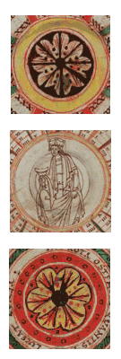
4. Figural illustrationApart from the zoomorphic brackets discussed above, the figural illustration in MS 17 consists of four zodiacal figures in the calendar, the king with the cup in the centre of the rotaon fol. 27v, and two sketches, virtually invisible save under ultra-violet light, one in the calendar for September (fol. 20r) and one in the margin of fol. 36r.
The four visible zodiac figures are Aquarius (January, fol. 16r), Pisces (February, fol. 16v), Gemini (May, fol. 18r) and Leo (July, fol. 19r). Space is set aside for illustrations in the other months, but they were never made. Each figure is positioned on the right side of the calendar page, approximately opposite the date on which the sun enters that sign. Aquarius and Gemini are labeled on yoke-like scrolls over their heads.
Iconographic parallels can be found in other contemporary or earlier calendars, and in illustrated treatises on the constellations, such as Cicero's Aratea. However, no exact match for Aquarius has been yet located. In the treatise in Oxford Bodleian Library Bodley 614, fol. 5v, Aquarius flexes his knees in the same direction, but he wears a loin-cloth, and carries a vase rather than a cylindrical jar; this is also the case in the calendar of Cambridge St John's College B.20, fol. 2v.38 In the Aratea in Baltimore Walters Art Gallery 734, fol. 11v, Aquarius is dressed in a short tunic and carries his jar in both hands, as in MS 17; however, he faces to the right, and once again, his jar is a vase. He also wears a short tunic and cloak in British Library Cotton Tiberius B.V. fol. 36r, but his pose, with his left hand on his hip while pouring from a ewer in his right, is very different; this is the same pose found in the Aratea in MS 17's sibling manuscript, the Peterborough computus (Tiberius fol. 24v). The Aquarius in Oxford Bodleian Library Digby 83 fol. 58r strides to the left as in MS 17, but holds his vase backwards over his hip.39
Iconographically, Pisces is the most stable of the zodiacal emblems; it can only be varied by reversing the directions of the upper and lower fish. MS 17's version is unremarkable except for the loops which the artist has introduced into the connecting ribbon.
The closest cognate to the Gemini is found in the Aratea in Oxford, Bodleian Library Bodley 614 fol. 3r and in the calendar in British Library Cotton Tiberius B.V. fol. 5v. The twins, garbed in tunics, stand cheek to cheek with the legs slightly overlapping and the arms around one another's shoulders. However, their free hands are posed differently: one points while the other lifts his hand as if holding on to a spear. This same pose appears in Bodleian Digby 83, fol. 64v.
The Aratea in Baltimore Walters Art Gallery 734 fol. 10v has a Leo which is very similar to the one in MS 17; standing on all four paws, with tail tucked between his legs. However, he faces outwards, with tongue projecting.
Barely visible on the September page fol. 20r) for Libra is a drypoint sketch on the September page (fol. 20r) for Libra, apparently a standing figure, holding out its arms like the balance of scale, and carrying two pans.
The first three zodiac figures share some stylistic features among themselves and with the decorative frames of the tables and diagrams in MS 17. The scales of Pisces recall the penstrokes and dots used to articulate reserved leaf motifs, and the spiral dotted garters winding up the hose of the Gemini echo the decoration of the columns in the termini table on fol. 28v. The facial features, hands and feet of Aquarius and the Gemini proclaim that they came from the same pen; their scrolls are labeled in Scribe A's rustica. Leo, however, is a different case. His foliage tongue looks like that of Scribe B's dog-bracket on fol. 101r; the treatment of the paws is also comparable to that of the dog, or the wyvern on fol. 90r, and his nose, like theirs, is a tight curl. At least two artists worked on the calendar drawings, and it is possible that they were Scribes A and B. Saxl and Meier claim that the zodiacal miniatures were added to MS 17 at a later date,40 but they must at least be contemporary with Scribe A, since in the May martyrology (fol. 18r) he is obliged to divide the phrase "et sancti Dunstani archiepiscopi" (19 May / XIII kl. iun.) to accommodate the Gemini.
The hub of the rota on fol. 27v contains the enigmatic figure of a beardless man dressed in a crown and flowing robes. His right hand holds a tall beaker or chalice; his left hand rests on his knee, index finger pointing downwards. No other example of this rota discovered to date contains a figure of any kind, and other "inhabited" rotae, like those illustrating Isidore's De natura rerum, never contain a king with a cup.41 This particular table is normally rectangular, not circular: indeed, it appears as a rectangular table as Gloss 52 in MS 17's copy of Bede's De temporum ratione. The choice of a circular format emphasizes the cyclical quality of the solar cycle, and suggests other circular representations of time, such as diagrams of the four seasons or the twelve months and their zodiac signs. These diagrams are not infrequently inhabited by a personification (or at least a label) of Annus, the year. Annus can be a bearded ancient holding aloft the sun and moon, or a Helios-like bust or charioteer, or even a majestas Domini.42 It is tempting to identify the king with the cup as an Annus-figure, but this must remain a hypothesis until a more exact cognate can be located. Certainly the crown and the cup are not commonly found as attributes of Annus.
Another mysterious man appears in the margin of fol. 36r, drawn in very faint crayon and only visible under ultra-violet light. This standing figure, clad in tunic and hose, has curling chin-length hair and a striking expression of sorrow or anxiety on his face. His hands are folded, as if in prayer. The treatment of the garments, hands and face suggests that he was drawn by the artist of the "king with the cup". This is probably not the same hand that drew Aquarius and Gemini. The king's robes fall into fan-like folds ending in a cascading zigzag hem, while the pleats of the Gemini's tunics are stiff and straight, and the attempt to depict Aquarius's tunic falling over his bent knees is not convincing. The Twins' coiffure is rather awkwardly segmented, while the king's is drawn in parallel lines. On the other hand, the king's face, the way in which his eyebrows form a single line with his nose, and the treatment of his mouth and hair is extremely close to that of the man holding a dragon across his shoulders which forms the T in TITVLVS in Thorney's entry in the mortuary roll of Vitalis of Savigny.43 The Thorney titulus was not written by any of the MS 17 scribes, and the tituli were collected in 1122-1123. It is possible, therefore, that the king with the cup is a slightly later addition to MS 17.
1 Alexander 1975, 149.
2 Avril 1964, 211 and Avril 1965, 212, 223, 225, 232, 234; Dodwell 1954, plates 4d and 11b.
3 Temple 1976, ill. 83 (Bosworth Psalter).
4 E.g. at Mont-Saint-Michel: see Alexander 1970, pl. 10f and Avril 1964, 502, 519.
5 McLachlan 1978, 339-340.
6 Delisle 1909, pl. XLVI.
7 Compare in particular the Helperic A to the two As on pl. 39 of Dodwell and Wormald 1960.
8 Alexander 1970, pl. 5b; Dodwell 1954, pl. 29d-g.
9 The trend began in the late 70s (Esmeijer 1978), particularly in connection with the Münster school headed by Friedrich Ohly (Ohly 1977, Ohly 2005, Maurmann-Bronder 1975 (and other articles in the same volume) and Maurmann-Bronder 1976; Text und Bild 1980...). The work of Mary Carruthers on monastic and scholastic forms of reading, memory and visualization have provided a fresh theoretical platform for the study of schemata (Carruthers 1990; Carruthers 1998; Carruthers and Ziolkowski 2002). Specialize studies have been made of the images created by Hugh of St Victor (Gautier Dalché 1988 and Sicard 1993), and of illustrations of Aristotelian texts and commentaries (Sherman 1995).
10 Murdoch 1984; Obrist 2004.
11 For example, Anton von Euw's brief essay "Die kunstlerische Gestaltung der astronomischen und komputistische Handscriften des Westens," in Science in Western and Eastern Civilization in Carolingian Times, 250-269, alludes to the mutation of plain reference tables into more elaborate representations, but goes not further than distinguishing mere diagrams from "Kunstwerke".
12 Henderson 1999, 89-90.
13 Dodwell 1954, ch. 2; Kauffmann 1975, ills. 65, 107-112, 116-118, 142, 147; Alexander 1970, ch. 3, esp. pp. 49, 63 and pl. 8d.
14 Kauffmann 1975, ills. 178-179.
15 Cf. Temple 1976, ill. 245; Kauffmann 1975, ills. 50, 122, 179, and the frames of the St Alban's Psalter (Dodwell and Wormald 1960, pl. 64).
16 Reproduced in Bober 1956-1957, 82.
17 See Fontaine's ed., p. 210 bis.
18 Outstanding early examples include a manuscript in Visigothic script from Silos (Paris BNF nouv. acq. lat. 2169) containing Isidore of Seville's Etymologiae with a preface of computus tables and diagrams in exceptionally elaborate and striking architectural frames. Paris BNF lat. 5239 (St Martial, Limoges, s. X) contains, like MS 17 fol. 6v-7r, a section on the degrees of affinity drawn from Etymologiae 9 (fols. 163r-166r) . The first two stemmae resemble the "step" and "tree" diagrams in Lindsay's edition. The third, normally a rota, is here rendered as an arcade with pen-drawn ornament on the columns and capitals redolent of MS 17. This example is interesting, because an architectural frame has actually supplanted the standard presentation.
19 Arches around texts, especially titles, dedications etc., are a common ancient and early medieval form of display, e.g. the dedication page of the Codex Amiatinus. Examples of lists arranged under architectural arcades include the catalogue of popes with the length of their reigns in MS Cologne 212, fols. 168v-169r: Glaube und Wissen 107.
20 Carruthers 1998, [page]
21 Nordenfalk 1938, 1.73.
22 Nordenfalk 1938, 1.74-78, 2 pl. 2-4. See for example the Codex Beneventanus, London, British Library Add. 5463 (San Vincenzo al Volturno? 739-760), whose canon tables are copied from a 6th century exemplar: Il futuro dei Longobardi no. 402; Kunst und Kultur der Karolingerzeit 2.704-705.
23 Nordenfalk 1938, 2 pl. 10b.
24 Nordenfalk 1938, 2 pls. 48-83, 162-167. For examples of an architectural canon table with grid pattern between the columns, see the "Thomas-Evangeliar", Trier, Domschatz 61 (Echternach, s. VIII 2/4) fol. 11, in Kunst und Kultur der Karolingerzeit 3.469; Paris, Bibl. de l'Arsenal 599 (ca. 790), fol. 8v, in ibid. 3.576; London, British Library Harley 2788 (ca. 800) fol. 6v in ibid.. 3.584. For an example of canon tables where the grid has entirely disappeared: the "Gundohinus Codex", Autun, Bibl. municipale S 3 (4) (Flavigny, ca. 780), fol. 15r, in ibid.. 3.477
25 Nordenfalk 1938, 1.121, ill. 8; Heurgon 1952; Chevallier 1972, 46-49.
26 E.g. the canon tables in the Carolingian Aachen Gospels, reproduced in Florentine Mütherich, "Die Buchmalerei am Hofe Karls der Grossen," in Braunfels (ed.) 1965-1967, 3, pl. 20, or Brescia, Bibl. civica Quiriniana Cod. E II, 9 (Aachen, s. IX in.), in Il futuro dei Longobardi n. 508, ill. 383, or in the Aachen Schatzkammer-Evangeliar (Aachen, s. IX in.), reproduced in Kunst und Kultur der Karolingerzeit 2. 707.
27 Hrabanus De computo 83, 302.47-48.
28 Rhetorica ad Herennium 3.16.29 (208).
29 Rhetorica ad Herennium 3.17.30 (208-210).
30 Rhetorica ad Herennium 3.17.31 (210).
31 For an example of a canon table where each column is markedly distinctive, see the Carolingian Gospels of Saint-Médard de Soissons, Paris BNF lat 8850, fol. 7v, in Kunst und Kultur der Karolingerzeit 3. 589.
32 An important cognate example is the Worcester MS, contemporary with MS 17, Oxford Bodleian Library Auct. F. 1. 9. fols. 27r sqq. discussed in Evans 1979, 86-87. See also the 11th c. MS Erlangen 395 fol. 35r, reproduced in Novari 1975, 143, and the drawing of abacus tables copied from MSS in Treutlin 1877, 599 sqq. (ed. of Gerlandus' treatise on the abacus).
33 Evans 1979, 81.
34 Rhetorica ad Herennium 3.18.31 (210).
35 Wallis 1990b; Wallis forthcoming.
36 Ordericus Vitalis 11 (vol. 6, 152); trans. by Chibnall.
37 On the influence of built architecture on manuscript illustration and decoration, see Heitz 1980, 201-206; Dodwell and Wormald 1960, 98 (on border motifs in the St Alban's Psalter); Zarnecki 1978, 40.
38 Kauffmann 1975, ill. 122.
39 Saxl and Meier 1953, v. 2, ills. 169-171.
40 Saxl and Meier 1953, vol. 1, 128.
41 Teyssèdre 1960.
42 See examples in Esmeijer 1979, figs. 5-6, Evans 1969, pl. 79, Bober 1948, 14; d'Alverny 1976, tav. 1.
43 Delisle 1903, pl. 46, no. 194.